Recently, I have been doing some work with User Stories. As a result the developers and I have started to estimate user stories using story points. This is a good way to allow a team of developers to collaboratively estimate the complexity of a piece of functionality and how long it will take to implement.
The question was asked about how we make our progress visible to internal and external stakeholders of the project. Unlike a traditional waterfall project there is no gantt chart or detailed project plan, only a series of iterations and some expected deliverables for each iteration. This lead us to think about how many story points we were expecting to complete in any single iteration.
Many of the projects that I have worked on in the past use Burndown Charts, but most of them were produced out of a project management tool. I decided to take the user stories that I had from the current project and have a go at producing my own Burndown Charts.
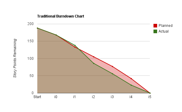
Using Google Docs I was able to take data from the user stories, broken down into the 5 iterations, or sprints as some prefer, and produce a burndown chart.

However, when I looked at it I couldn’t help but think that it looked too good. Like the project had been too easy. I went over my notes and I was reminded of two things that happened during the project:
- The teams estimates changed
- Scope creep set in
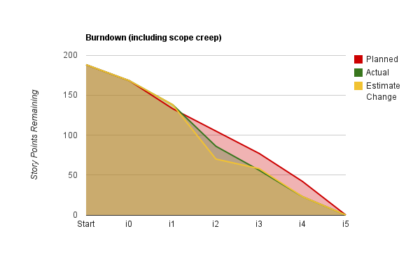
What that actually meant was that while the project looked like it had gone really quickly and that we had over estimated the user stories in each iteration, there had been some changes mid-project that we had negotiated and these had effected the overall number of story points in the project. To better show this I have produced a second chart that I think helps stakeholders see the movement in scope in relation to the burndown.

The addition of the ‘scope’ line shows the burn down in a slightly different light.
At the end of iteration 1 (i1) the developers are behind of where they should be. Being an iteration in and being able to rework their estimations they deem some tasks to be more effort and increase their estimations to match. This saw an increase of 5 story points, 2.6% of the project.
At the end of iteration 2 (i2) the client team dropped a piece of functionality. We were able to cater for this change and thus removed 18 story points, 9.5% of the total project.
The rest of the project continues on its projected line but had there not been an additional line to show change the client team could have easily misunderstood why the project was in its current state.
I don’t know how people feel about using such charts and if hacking them to show more information is allowed. I believe strongly in giving clients as much useful information and feedback as is possible. It is important that a client team see a strong correlation between scope creep and effort. If the scope of a project is increased a project will, in most scenarios, take longer. However, if a scope is decreased then often there is time savings.
That last point about time is one thing that I should extend on. We struggled to take the conceptual theory of a story point, determine a velocity and then convert that to developer days. In the end we settled with estimating in developer hours, so 1 story point = 1 dev hour. This seems like a bit of a cheat and not as pure as intended, if anyone has suggestions on how to improved project estimations I’d love to hear from you.
