In my last post I discussed designing for Mobile First. But before you can start designing for mobile, it’s a good idea to have an understanding of how users are using mobiles and tablets to interact with your website and consume your content. Although it is true that overall mobile and tablet usage is on the rise, different industries are seeing different usage of these device.
Using this Dashboard Junkie dashboard as a base, I was able to create a dashboard that attempted to answer a number of key questions designers may be asking when starting a mobile first project:
- Which breakpoints are most popular on my website
- Which browsers are we designing for (and testing in)
- What input methods are users using
Try adding it to your Google Analytics account and let me know how you get on.
Dashboard components
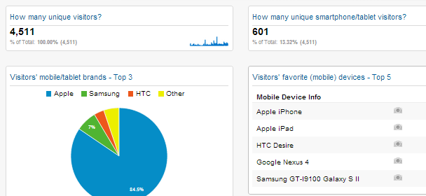
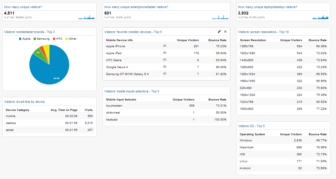
How many unique visitors?
Here you’ll see a count of how many different users (or computers/devices, really) that have visited your website.
How many unique smartphone visitors?
Here you’ll see how many of your visitors are using a smartphone or tablet to interact with your website and consume your content.
How many unique laptop/desktop visitors?
This widget counts the number of visitors that didn’t use a tablet or smartphone to view your website content.
Just below the large figure you will see a percentage that tells you how this number compares to the total number of visitors.
Visitors’ mobile/tablet brands – Top 3
A pie chart that displays the top 3 smartphone/tablet brands used among your audience.
Visitors’ favorite (mobile) devices – Top 5
This widget tells you exact brand and model of your mobile visitors.
Only smartphones/tablets will relay their brand and model information to Google Analytics.
Laptops/desktop cannot be identified in such detail.
Tip: Click on the photo/camera icon and you will see one or more pictures of the hardware device in question.
Visitors’ screen resolutions – Top 10
Here you can check out the display resolution (measured in Pixels) of your visitors. This information can be very useful when making decisions about where to place your breakpoints.
Visitors’ favorite browsers
Here you can see the most popular browsers that users are using to view your website. This will help you to identify which browsers to prioritise testing on.
Visitors’ dwell time by device
Here you can see the average page view time by each device category. This information can be helpful to understand which devices users use when completing certain tasks on your website.
Visitors’ mobile inputs selectors – Top 5
Here you can see the input methods users use to interact with your website. You can use the information to make decisions about how to layout your navigation, input fields and button sizes.
Visitors mobile OS – Top 5
Here you can see the most popular operating systems used by your visitors. This information can be really helpful if you’re considering developing a mobile app and you want to know which platform to prioritise first.