I’ve been playing with some of the latest Axure 7 features recently and one of my favourites is the new Adaptive Views feature. Adaptive Views define the breakpoints where you want your pages to switch to a different layout or style. This allows you to prototype in a way that forces you to consider your mobile and tablet experience. Former Yahoo! design architect Luke Wroblewski, coined the expression Mobile First to describe the process of designing websites and other software for the mobile first, rather than last (as can often happen).
Why’s it important?
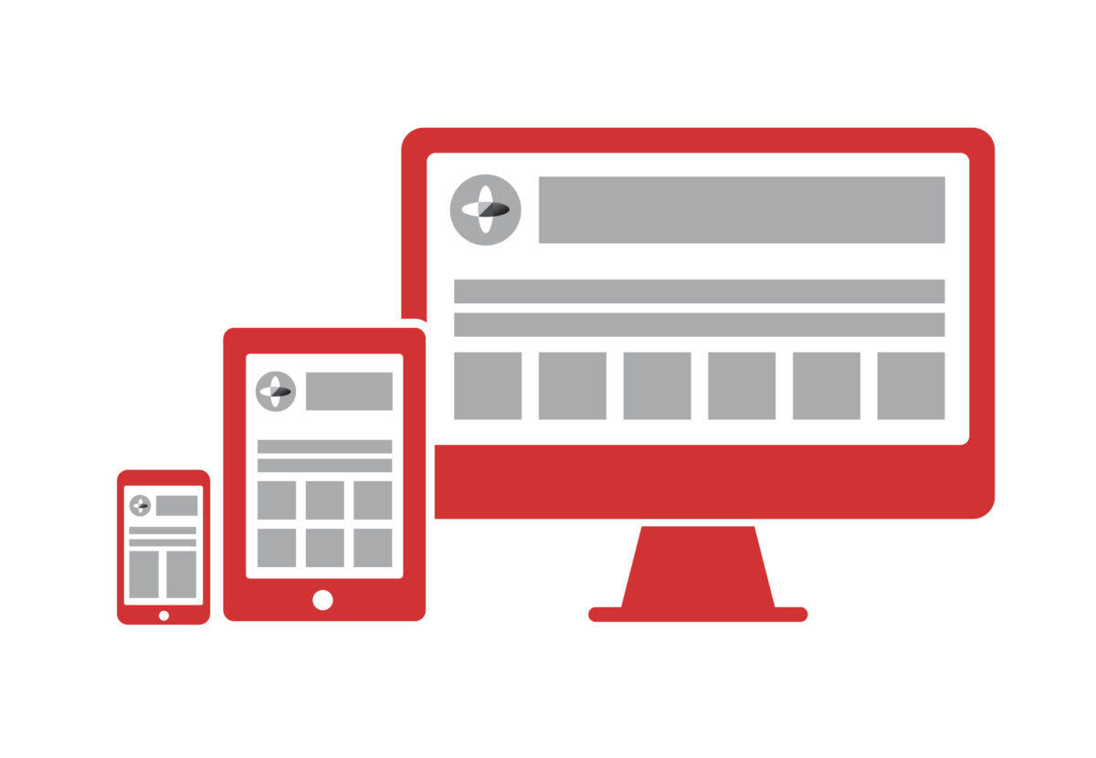
While responsive web design is not entirely new, designers and developers have often struggled to demonstrate how a responsive site will look on different devices, prior to build. The options are usually to design up every view individually or to prototype in HTML & CSS. The former option often lacks any detail of how interaction will take place, whereas the latter often focuses too heavily on technical implementation and can sometimes overlook visual treatment and design aesthetics.
Designing for mobile first 1:
- Prepares you for the explosive growth and new opportunities emerging on mobile today
- Forces you to focus and prioritise your products by embracing the constraints inherent in mobile design
- Allows you to deliver innovative experiences by building on new capabilities native to mobile devices and modes of use.
Axure allows UX and interaction designers to prototype with both realistic interactions and visual treatment. The outcome is a realistic representation of your website or application in a range of views, for different devices.
How it works
Adaptive views are based on browser/device width and/or height. Axure has a range of mobile and tablet dimensions (in both landscape and portrait orientation) predefined out of the box. Views inherit from one another so a change to the location, size, or style of a widget in the parent view affects its children, but a change in the child view does not affect the parent.
Editing a widget’s text, interactions, and other widget properties affects the widget in all views. The widget is the same widget across views (not a copy) so you only have to update the property once.
While most of the tutorials show desktop being created as the base view that all other views inherit from, I would encourage you to consider using the 320px width mobile portrait view as your base and inheriting up through the spectrum until you reach desktop. This will make your prototype truly mobile first and force you to consider interactions and behaviours that may get overlooked if you settle for a more traditional approach.
The prototype switches views based on the browser size or can be manipulated using the adaptive view icon in the left hand sitemap. I have hosted the Axure Learn example here.
What I’ve discovered
If you have been using Axure prior to version 7’s release this new feature shouldn’t take you too long to get to grips with. It is possibly quite advanced for novice users of Axure, but everyone has to start somewhere.
I noticed a significant performance drop in Axure when using a number of images and widgets across multiple views. I am hoping that future updates to Axure 7 will improve this.
Out of the box Axure doesn’t add a viewport tag like this to its HTML generated prototypes:
<meta name="viewport" content="width=device-width">
In order to configure this navigate to: Publish > More Generators & Configurations… > HTML > Mobile/Device and tick Include Viewport Tag.
 Mobile first by Luke Wroblewski
For more on Mobile First check out Luke Wroblewski’s book.
Need help with your next prototype project? Why not get in touch.