Axure goes Mobile First

I’ve been playing with some of the latest Axure 7 features recently and one of my favourites is the new Adaptive Views feature. Adaptive Views define the breakpoints where you want your pages to switch to a different layout or style. This allows you to prototype in a way that forces you to consider your mobile and tablet experience. Former Yahoo! design architect Luke Wroblewski, coined the expression Mobile First to describe the process of designing websites and other software for the mobile first, rather than last (as can often happen).

Why’s it important?

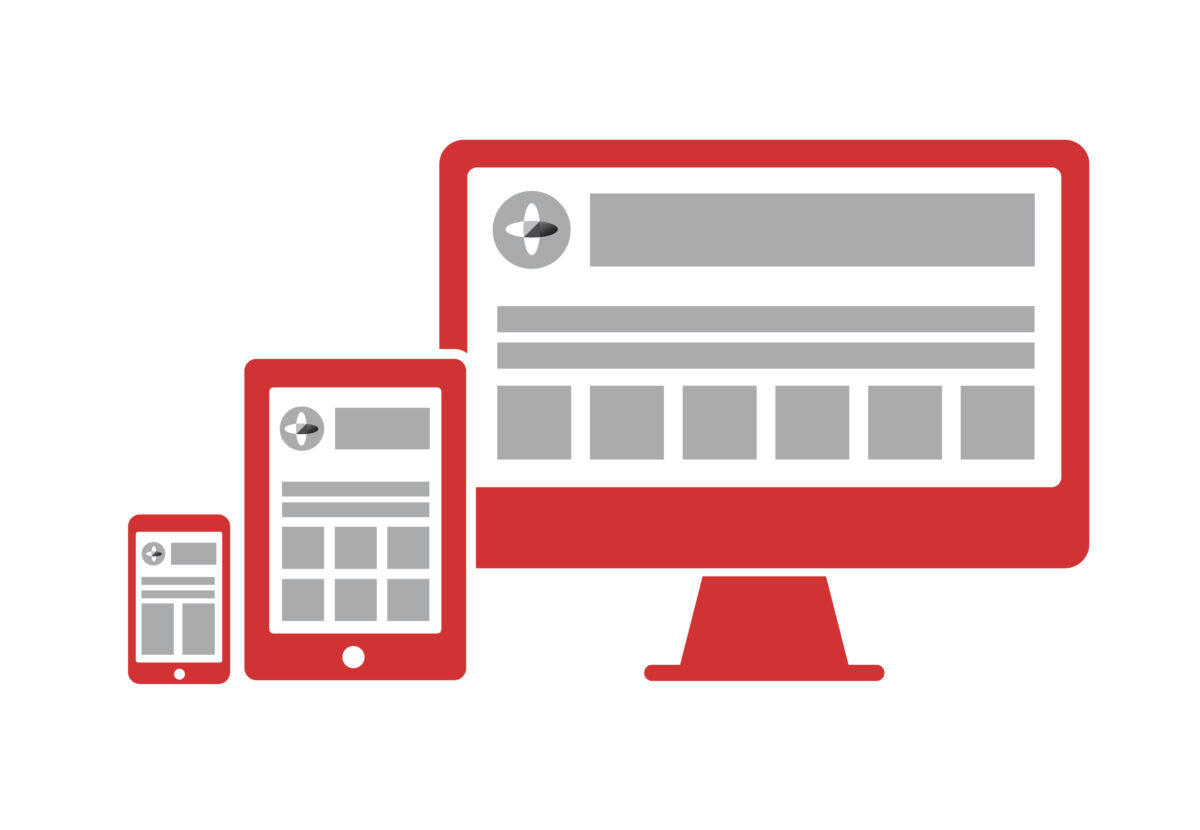
While responsive web design is not entirely new, designers and developers have often struggled to demonstrate how a responsive site will look on different devices, prior to build. The options are usually to design up every view individually or to prototype in HTML & CSS. The former option often lacks any detail of how interaction will take place, whereas the latter often focuses too heavily on technical implementation and can sometimes overlook visual treatment and design aesthetics.

Designing for mobile first 1:

  • Prepares you for the explosive growth and new opportunities emerging on mobile today
  • Forces you to focus and prioritise your products by embracing the constraints inherent in mobile design
  • Allows you to deliver innovative experiences by building on new capabilities native to mobile devices and modes of use.

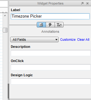
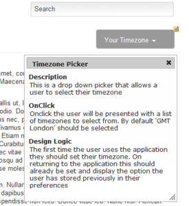
Axure allows UX and interaction designers to prototype with both realistic interactions and visual treatment. The outcome is a realistic representation of your website or application in a range of views, for different devices.

How it works

Adaptive views are based on browser/device width and/or height. Axure has a range of mobile and tablet dimensions (in both landscape and portrait orientation) predefined out of the box. Views inherit from one another so a change to the location, size, or style of a widget in the parent view affects its children, but a change in the child view does not affect the parent.

Editing a widget’s text, interactions, and other widget properties affects the widget in all views. The widget is the same widget across views (not a copy) so you only have to update the property once.

While most of the tutorials show desktop being created as the base view that all other views inherit from, I would encourage you to consider using the 320px width mobile portrait view as your base and inheriting up through the spectrum until you reach desktop. This will make your prototype truly mobile first and force you to consider interactions and behaviours that may get overlooked if you settle for a more traditional approach.

The prototype switches views based on the browser size or can be manipulated using the adaptive view icon in the left hand sitemap. I have hosted the Axure Learn example here.

What I’ve discovered

If you have been using Axure prior to version 7’s release this new feature shouldn’t take you too long to get to grips with. It is possibly quite advanced for novice users of Axure, but everyone has to start somewhere.

I noticed a significant performance drop in Axure when using a number of images and widgets across multiple views. I am hoping that future updates to Axure 7 will improve this.

Out of the box Axure doesn’t add a viewport tag like this to its HTML generated prototypes:

<meta name="viewport" content="width=device-width">

In order to configure this navigate to: Publish > More Generators & Configurations… > HTML > Mobile/Device and tick Include Viewport Tag.

Mobile first by Luke Wroblewski

For more on Mobile First check out Luke Wroblewski’s book.

Need help with your next prototype project? Why not get in touch.

[1] Katie Messner. Sep 30, 2013. “Mobile Gov Wiki.” [online]. mobilegovwiki.howto.gov

Prototyping your processes diagrams

This week I heard a fantastic podcast over at TheBACoach.com about writing high value user stories through structured conversations. In it Ellen Gottesdiener and Mary Gorman, authors of Discover to Deliver, suggested collaboratively working on process diagrams with your customers. In fact, they suggested encouraging stakeholders to break the diagrams!

The idea got me pretty excited about a project I’m currently working on and some workshops I had coming up. Although I’m pretty confident at diagramming as a requirements specification technique and have studied UML, BPMN and database modelling techniques, I rarely use them for elicitation purposes. And I have to say, however confident I am with the practice, I’m always worried that a stakeholder will spot the bit I’ve missed or will mention an edge-case that I didn’t identify. But Ellen and Mary were suggesting a completely different approach – hold your hands up and say it’s not finished, that it needs some polish and it needs input to be completed and allow your stakeholders to roll their sleeves up and participate in the drawing of your process diagrams.

Something similar to the finished product. Basic, bare even, but full of meaning to the team who helped craft it.

So that’s exactly what I did, I thought back to some of my experiences of prototyping wireframes and some of the lessons learnt are very transferable. Mainly, if the prototype looks polished stakeholders will think it’s finished (and will often be far more critical). So, we used paper and pens to draw out a basic process flow, there were no swimlanes or beautiful straight lines that a tool would give you, but it was there, a vehicle for some structured conversation.

I put it on the table with some other pens and watched as the team looked at it, quite shocked at how bare it was (probably questioning my fee…) but straight away people started drawing on the missing elements. And then they took it further, “this bit is only happens if X is true” and “We want to be able to delay a step, in fact we’d like to be able to delay two of the steps.”

We were prototyping a process flow, well they were and I was taking the notes from all the business logic and constraints that were being discussed. And because I wasn’t holding the pen and doing all the work I was able to sit back and facilitate the discussion and prototyping, dipping into the 7 Product Dimensions [pdf], that I also learnt about on the podcast, ensuring that we had covered where the ‘data’ was coming from for an aspect of the diagram or what the ‘control’ was around another.

Now I was lucky, the team I was working with are pretty technical. In fact they are a mix of subject matter experts and other analysts, which made the job a bit easier. But even if your team aren’t expert diagram drawers, with your help they’ll be able to articulate enough to help you draw something that they can validate. Constantly ask questions like:

  • Is this right?
  • Is there anything that happens after this step?
  • Is there anything missing that you can see?

Working with your stakeholders in this way will help them to feel empowered in the delivery of your project, it helps develop rapport between the team and will pay dividends over the lifetime of the project.

Annotating wireframes for delivery: the agile way

I usually try and keep these posts technology agnostic, but when it comes to wireframing it has to be said that I’m an Axure fanboy. I know there are lots of other great tools out there but this is the one that I’ve settled on.

Axure has a built-in specification generator, which reminds me of projects where the quality of my deliverables were measured by the length of the documents. However, I’ve been playing with some of these settings in order to turn the built-in features into something a bit more useful. Here’s what I discovered:

The Annotations Widget

This is the Annotations panel within the Widget Properties Pane (you can open it using ctrl+1). By default it has lots of options, covering a range of needs from the features status, risk, owner and benefit etc. While this is all very useful it can feel a bit overwhelming if you don’t know all that information or feel like you’re duplicating effort by repeating info that is already being captured against your user stories. To help me capture what I need, without writing war and peace, I’ve opted for the following fields:

axure widget properties
An example of the annotation properties with Axure 6.5

<dl>

Description
I use this field to describe what the feature is, nothing fancy. “This is a drop down picker that allows a user to select their timezone”.
OnClick
This field describes what the user can expect to happen when they interact/click on the feature. “Onclick the user will be presented with a list of timezones to select from. By default ‘GMT London’ should be selected”.
Design Logic
I use this field to describe when the feature will be shown and any edge cases where the design or layout may change. “The first time the user uses the application they should set their timezone. On returning to the application this should already be set and display the option the user has stored previously in their preferences”.

dynamic notesOn generating the prototype it builds into HTML and adds a small iconnote over the top right hand corner of the feature. If you hover over them your cursor will change to have a ‘?’.

When you click on the note it will open up and can be moved around the page, in order to prevent it to obscure the feature it is describing.

You can play around with combinations of fields that you use and even have different ones saved for different clients. Any fields that are left blank when annotating your prototype will not be shown once the HTML is generated.

Sharing Axure Files

If you’ve not seen it yet I strongly recommend Axure Share. It allows you to store and share your Axure prototypes and even has functionality to allow users to discuss elements on the prototype.

Read More…

If you want to find out more about the Axure annotations feature why not check out the following:

Bringing Projects to Life Through Rapid Prototyping

Last week I presented a breakout session at Camp Digital 2013 on the topic of Rapid Prototyping.

Synopsis

Design and build projects are often difficult to kick-off, especially when you’re struggling to convey your ideas and understand the solutions being suggested. This can lead to delays, confusion and potential rework.

Sound familiar?

Rapid prototyping provides a quick and visual solution to identifying, documenting and validating project requirements in an interactive way.

In this session Jamie will take you through examples of rapid prototypes and show you how this approach can bring your projects to life and reduce development time, costs and help to maintain your relationship with your clients.

The presentation

Sigma Camp Digital 3D Shadows
Camp Digital – Manchester, UK

Camp Digital is a free, one-day event in Manchester exploring some of the most important and emerging themes in the digital industry.

Why not check out some more presentations and videos here?

Prototyping for BA Practitioners: The BA Coach

prototyping-for-business-analysis-pracitioners-572x168
When I started this blog my intention was to create something that would encourage me to learn new skills and document them in a way that meant I would remember them and could develop them in the future. Since I started writing I have come into contact with BAs from all over the world who are looking to do something similar, some to develop themselves and some to develop others.

One of the BAs that I have met and come to admire, for his personal pursuit of excellence and commitment to develop others, is Yamo a.k.a. TheBACoach.

I was thrilled when recently I was asked to be a guest author for TheBACoach. Over the next few weeks and months I will be working alongside Yamo to deliver some blog posts, podcasts and video training to help equip BAs in the art of prototyping and promote its use.Watch Full Movie Online Streaming Online and Download

I’m really keen to hear feedback on the articles/podcasts/videos. If you can think of ways you think they need to improve or have topics that you want covered in the series please let me know.

Prototyping: understanding the benefits to fidelity

If you’ve been around any software development projects then there is a good chance that you’ll have seen wireframes. Some sketched, maybe some mocked up in prototyping tools or crafted in photoshop. They are a popular tool to help conceptualise page layouts or even go as far as to demonstrate interactions in an application.

The level of detail or interaction that is present in a prototype is often described as fidelity. Fidelity is the degree of closeness to the “depth, breadth and finish of the intended product” (Hakim & Spitzer) [1].

To help explain the difference between low and high fidelity the following definitions are from Usability First:

low-fidelity prototype

a prototype that is sketchy and incomplete, that has some characteristics of the target product but is otherwise simple, usually in order to quickly produce the prototype and test broad concepts. [2]

These are the prototypes that you’d sketch in your notepad when describing the layout of a page or the interaction of an element with a colleague. You may capture them in a meeting with a client as a visual record of what has been discussed, so that you can work them up later into a design concept or higher fidelity prototype.

high-fidelity prototype

a prototype that is quite close to the final product, with lots of detail and functionality. From a user testing point of view, a high-fidelity prototype is close enough to a final product to be able to examine usability questions in detail and make strong conclusions about how behavior will relate to use of the final product. [2]

Unlike the quick sketch in your notebook, a high-fidelity prototype is at the other end of the scale. It’s likely to be rich with interaction, styled graphics and layouts that give the appearence of the finished product.

These are the two extreme end of the scale and in reality you will often be working somewhere between them. Some prototypes will have interactions but not so much visual treatment. Others will be worked up to a high level of design treatment but are just flat images, produced in photoshop with some image regions placed over the navigation to give the impression of a clickable ‘wired-up’ prototype. The reality is that often prototypes are just the vehicle to help us prove a concept or elicit requirements. They are not the end goal, just a means to help you reach it, so we take them as far as we need to go – as far as they remain useful and then we stop and move into code. Your choice about whether you go with a low vs high-fidelity approach is likely to be based on a time/cost/benefit decision, and each project is likely to be different.

There is nothing wrong with low or medium fidelity prototypes. I’ve worked on a number of great projects where this level of prototyping has generated some real rewards for all parties involved. However, more recently I have been working with very high-fidelity prototypes in two new ways. They are:

  1. JAD sessions
  2. Task based user testing

1. JAD Sessions
The purpose of a JAD session is to dramatically reduce the timeframe required to complete a deliverable where consensus is required by getting all of the major decision-makers, stakeholders, and knowledge providers into one place all at the same time.

The real-time production of a prototype during a JAD can help stimulate the discussion, capture decisions and demonstrate ideas and concepts to non-technical stakeholders.

Questions like, “What fields do we want to be capturing during the signup process” are easily answered when a marketing representative is present along with your database administrator. Consensus is reached and the prototype is updated to reflect this detail. The designer gives his input on the layout and one of the developers is able to highlight a constraints of the existing technology stack used. And then you move on to the next decision.

The prototype acts as the living record. The organic deliverable that in the space of 2 or 3 days has grown to encompass all the requirements, decisions and actions.

2. Task based user testing

Task-based User Testing is all about learning how users interact with your application or website in order to access information and complete tasks. Nielsen states that the biggest improvements in user experience come from gathering usability data as early as possible. He estimates that it’s 100 times cheaper to make changes before any code has been written than to wait until after the implementation is complete [3]. With this in mind it’s important to get user feedback and research findings as early in the process as possible, waiting until the site or application is live can be costly and impracticable.

While the prototype is not the finished product it’s important that it is worked up to a very high fidelity so that users are comfortable with its look and feel and aren’t distracted by inconsistent elements or broken interactions. The prototype requires a high level of polish and a set of well crafted scenarios to test and journeys through the prototype.

Working a prototype up to the is degree of fidelity requires time and skill but it’s a worthwhile investment to ensure that you can capture user feedback in the design phase, before any code is written.

Conclusion

Prototyping at any level will give you a great return. Your decisions on how close to make it to the finished product will depend on your budget, your deadline and the influence you are trying to achieve with it.

[1] Farnum, Chris. 2009. “What you should know about prototypes for user testing.” [online]. Published on 29th July 2009. http://www.boxesandarrows.com
[2] “Usability First, Glossary”. Accessed on 11th July 2012. http://www.usabilityfirst.com/
[3] Nielsen, Jakob. 2003. “Paper Prototyping: Getting User Data Before You Code.” Published on 14th April 2003. http://www.useit.com