Going beyond ‘what success looks like’

#BASummit14: I was lucky enough to be asked to take part in this years BA Summit by Penny Pullan of Making Projects Work Ltd.

To hear my talk on this topic you check out my SoundCloud.

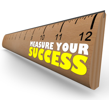
Over the past couple of years I have seen a growing trend in BAs and product teams striving to define what ‘success looks like’. It’s comes from a desire within the business to understand how we’ll know when we’ve achieved what we set out to do and what the world will look like at the finish line.

I think it’s worth recognising that there are probably a collection of terms out there that describe similar things here. You may call the, Critical Success Factors in your organisation and have associated KPIs.

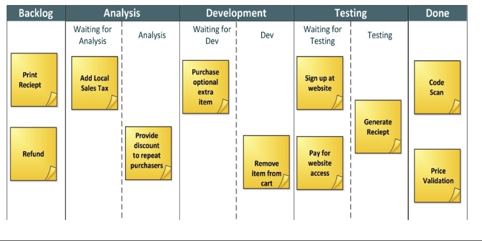
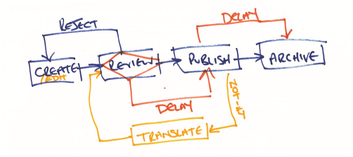
If you’re working in a Scrum team you may refer to theses as the Definition of Done, a series of criteria or success factors that must be met in order for something to be considered as completed, as done.

The closest I could find in the BABOK about measuring success was in chapter 6.3 Specify and Model Requirements [1]:

The activity of analysing expressed stakeholder desires and/or the current state of the organization using a combination of textual statements, matrices, diagrams and formal models

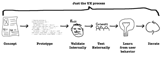
I’m a real advocate of this approach and have found it resonates well with the product team I sit in, as together we defining a testable state in which to measure if we have achieved our intended goal. This is similar to the team’s approach in writing software, where they will write tests that fail, prior to writing a line of code. They then write software that passes the tests that were defined. Once all the tests pass the project is finished.

However, too often I think BA’s try and define success far too late in a projects life cycle and as a result, miss out on being able to show real business value early in the process.

Lean Statup

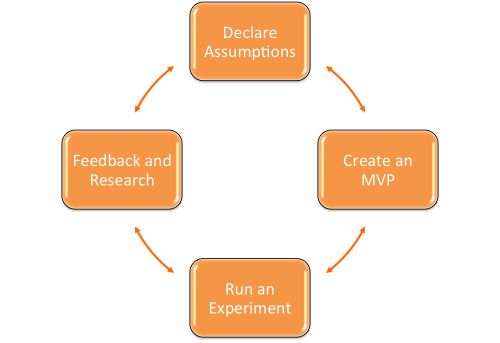
Many of you may have heard of Eric Ries and Lean Startup. You may have discredited it as applying to your organisation, as you’re not a startup, but I believe that everyone can use Lean Startup principles in their work, especially business analysts.

Eric discusses in his book, The Lean Startup, a new approach to testing hypothesis to help innovation. I believe we can use this same approach when identifying the impact of problems we uncover in our projects, whether it is a bug, an inefficient process or a missed deadline. And using the same principles we can continual measure for the improvements made as we get to work on tackling those issues.

Measuring failure, the “as is” state

So before we can measure what success looks like I encourage people to re-frame the problem. I ask them what failure looks like, often to their surprise. What I mean is, if we did nothing to resolve this issue what would the cost or impact top the business be. This may cause them to go and collect some information in order to answer this, but chances are they have a good idea and can articulate it.

This is a great place to start and will have many other benefits that can feed your product vision, and even help with ROI calculations further down the line.

Once you understand the problem or opportunity, you can start to consider solutions for achieving your goals, but how will we know that we’ve actually been successful?
If you work for a company that sells products online it may be easy for you to measure success. If you sell more items or increase your profit on what you sell, you’ve clearly been successful and perhaps these are some of the most obvious ways of measuring success and may not require models or equations to prove it.

However, if your project doesn’t have an obvious revenue stream to measure, you may need to be a little more creative with what you measure – and this I think, is where Business Analyst can really take a lead.

Have you ever considered the impact your project may have on customer satisfaction? Do you know what your current customer satisfaction score is and would you know how to measure it? Do you know where you rank amongst competitors, especially the ones that you are chasing for market share? I’m willing to bet someone in your organisation already knows the answer to all of those questions!

Do you know how long a manual process takes to run in your organisation? If you could identify improvements then you could calculate an efficiency saving to the business in terms of employee cost or an increase in productivity per employee.

Now measurement isn’t just something that we do at the end of projects. I often hear of the Definition of Done or the definition of what success looks like as being the finish line of a race that once crossed, means the project is closed. While this is true, I sort of dislike the analogy as it suggests it’s the last thing that happens in a project. I believe measuring success is a continuous process. if the definition of what success looks like is our finish line we measure at every step along the race course asking the question, have we crossed the line? Have we improved revenue, have we improved customer satisfaction? For teams that work on incremental delivery strategies, this data is crucial in checking that the team are going in the right direction and if they’re not this data will help support the need for changing direction or pivoting. This in itself is ensuring project success by getting early visibility of failure and risks.

Change, measure, change, measure…

So I’ve explained how I think measuring should take place at every step of the journey and how “what success looks like” is the finish line, the goal we’re aiming for. But in reality the improvements and gains that we see from the success of our projects don’t end once we cross that finish line. If you’ve managed to see an increase of 2% in sales as a result of your project, that’s for life. The business will continue to see that additional value month on month and as a BA I think it’s important that we shout about success and recognise the value that we as BA’s and the teams we support add to the organisation we live in. Everyone likes to have evidence they can show their boss that the project they’ve delivered was successful… And if it over achieved, how pleased will you be that you were tracking the data from day 1!

Conclusion

So to conclude I want to just recap on what I’ve said and recommend some further reading:

  1. Measuring success is linked right back to your initial requirements and stakeholder desires. You’re helping your team prove that they’ve been met with real data
  2. Measuring success is a continuous process, measuring it at the end is too late… you could be miles off and have not known
  3. Measuring success continuously reduces risk and allows for innovation and agility
  4. Evidence of success is the best reward of all, and will really help you as a BA
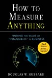
How to Measure Anything: Finding the Value of Intangibles in Business by Douglas Hubbard

For more on creative measuring check out Douglas Hubbard’s book.

[1] 2009. “IIBA BABOK V2.” [online]. iiba.org/babok

Senior Business Analyst: Laterooms.com

So I’ve not had chance to update my blog recently. A lot has changed in the months that I’ve been away…

laterooms_logoEarlier in October I took up a new and exciting role at Laterooms.com, the UK’s leading hotel booking company. It’s an exciting role for a number of reasons:

  • I’ll be joining a team of 10 other great BAs, so expect more posts and maybe even some collaborations
  • It allows be to focus on a single product, or at least a single organisation for a while
  • It’s based right here in Manchester, so I can balance work and home life a little better

The job move coincides with a house move too. Then family and I have moved to a larger house with plenty of room for the kids to grow up in. We’re still surrounded by boxes but as soon as we’re settled I’ll be blogging again.

Some blog posts coming up include:

  • Paper prototyping with the UX stencil
  • Writing effective User Stories for backend systems and APIs
  • Defining success and measuring business benefits
  • Decoupling UX from Development in Scrum

If anyone has any blog requests please let me know.

Thanks,
Jamie

Using Analytics to Design for Devices

In my last post I discussed designing for Mobile First. But before you can start designing for mobile, it’s a good idea to have an understanding of how users are using mobiles and tablets to interact with your website and consume your content. Although it is true that overall mobile and tablet usage is on the rise, different industries are seeing different usage of these device.

device-dashboard_featured

Using this Dashboard Junkie dashboard as a base, I was able to create a dashboard that attempted to answer a number of key questions designers may be asking when starting a mobile first project:

  • Which breakpoints are most popular on my website
  • Which browsers are we designing for (and testing in)
  • What input methods are users using

Try adding it to your Google Analytics account and let me know how you get on.

Dashboard components

How many unique visitors?
Here you’ll see a count of how many different users (or computers/devices, really) that have visited your website.

How many unique smartphone visitors?
Here you’ll see how many of your visitors are using a smartphone or tablet to interact with your website and consume your content.

How many unique laptop/desktop visitors?
This widget counts the number of visitors that didn’t use a tablet or smartphone to view your website content.

Just below the large figure you will see a percentage that tells you how this number compares to the total number of visitors.

Visitors’ mobile/tablet brands – Top 3
A pie chart that displays the top 3 smartphone/tablet brands used among your audience.

Visitors’ favorite (mobile) devices – Top 5
This widget tells you exact brand and model of your mobile visitors.

Only smartphones/tablets will relay their brand and model information to Google Analytics.

Laptops/desktop cannot be identified in such detail.

Tip: Click on the photo/camera icon and you will see one or more pictures of the hardware device in question.

Visitors’ screen resolutions – Top 10
Here you can check out the display resolution (measured in Pixels) of your visitors. This information can be very useful when making decisions about where to place your breakpoints.

Visitors’ favorite browsers
Here you can see the most popular browsers that users are using to view your website. This will help you to identify which browsers to prioritise testing on.

Visitors’ dwell time by device
Here you can see the average page view time by each device category. This information can be helpful to understand which devices users use when completing certain tasks on your website.

Visitors’ mobile inputs selectors – Top 5
Here you can see the input methods users use to interact with your website. You can use the information to make decisions about how to layout your navigation, input fields and button sizes.

Visitors mobile OS – Top 5
Here you can see the most popular operating systems used by your visitors. This information can be really helpful if you’re considering developing a mobile app and you want to know which platform to prioritise first.

Axure goes Mobile First

I’ve been playing with some of the latest Axure 7 features recently and one of my favourites is the new Adaptive Views feature. Adaptive Views define the breakpoints where you want your pages to switch to a different layout or style. This allows you to prototype in a way that forces you to consider your mobile and tablet experience. Former Yahoo! design architect Luke Wroblewski, coined the expression Mobile First to describe the process of designing websites and other software for the mobile first, rather than last (as can often happen).

Why’s it important?

While responsive web design is not entirely new, designers and developers have often struggled to demonstrate how a responsive site will look on different devices, prior to build. The options are usually to design up every view individually or to prototype in HTML & CSS. The former option often lacks any detail of how interaction will take place, whereas the latter often focuses too heavily on technical implementation and can sometimes overlook visual treatment and design aesthetics.

Designing for mobile first 1:

  • Prepares you for the explosive growth and new opportunities emerging on mobile today
  • Forces you to focus and prioritise your products by embracing the constraints inherent in mobile design
  • Allows you to deliver innovative experiences by building on new capabilities native to mobile devices and modes of use.

Axure allows UX and interaction designers to prototype with both realistic interactions and visual treatment. The outcome is a realistic representation of your website or application in a range of views, for different devices.

How it works

Adaptive views are based on browser/device width and/or height. Axure has a range of mobile and tablet dimensions (in both landscape and portrait orientation) predefined out of the box. Views inherit from one another so a change to the location, size, or style of a widget in the parent view affects its children, but a change in the child view does not affect the parent.

Editing a widget’s text, interactions, and other widget properties affects the widget in all views. The widget is the same widget across views (not a copy) so you only have to update the property once.

While most of the tutorials show desktop being created as the base view that all other views inherit from, I would encourage you to consider using the 320px width mobile portrait view as your base and inheriting up through the spectrum until you reach desktop. This will make your prototype truly mobile first and force you to consider interactions and behaviours that may get overlooked if you settle for a more traditional approach.

The prototype switches views based on the browser size or can be manipulated using the adaptive view icon in the left hand sitemap. I have hosted the Axure Learn example here.

What I’ve discovered

If you have been using Axure prior to version 7’s release this new feature shouldn’t take you too long to get to grips with. It is possibly quite advanced for novice users of Axure, but everyone has to start somewhere.

I noticed a significant performance drop in Axure when using a number of images and widgets across multiple views. I am hoping that future updates to Axure 7 will improve this.

Out of the box Axure doesn’t add a viewport tag like this to its HTML generated prototypes:

<meta name="viewport" content="width=device-width">

In order to configure this navigate to: Publish > More Generators & Configurations… > HTML > Mobile/Device and tick Include Viewport Tag.

Mobile first by Luke Wroblewski

For more on Mobile First check out Luke Wroblewski’s book.

Need help with your next prototype project? Why not get in touch.

[1] Katie Messner. Sep 30, 2013. “Mobile Gov Wiki.” [online]. mobilegovwiki.howto.gov

Kanban: Optimising for predictability – presentation

In the next couple of weeks I’ll be presenting at a ‘Lightning Lunch’ at Sigma UK on Kanban and how you can optimise the flow of tiny tasks (stories) to make predictable deliverables. This presentation is based on a blog post I wrote some time ago on the same subject.

I’m currently working on a very large Scrum programme that uses a board very similar to a Kanban board, however, we’re not enforcing WIP limits and we only ship things once a sprint. While this in itself feels very fast and very agile to some, it’s not without risks and sometimes feels a little ‘big bang’ release due to the amount of code that is getting delivered in a single sprint. This got me thinking about the continuous test and deployment cycles within Kanban teams as a potential enhancement to our current process.

Kanban doesn’t pretend to solve the problems, but it does allow teams to focus on continuous delivery and continuous improvement. It encourages teams to work as a multi-disciplinary unit rather than as a collection of silos and functions.

I should say that I have only ever done this ‘agency-side’ and as a result commercial constraints sometimes limit our ability to apply too aggressive WIP limits. I’d be really interested in hearing from anyone who has experience of running Kanban projects for multiple customers within a software/design agency. I’m sure there is some additional tweeks to help the implementation.

Prototyping your processes diagrams

This week I heard a fantastic podcast over at TheBACoach.com about writing high value user stories through structured conversations. In it Ellen Gottesdiener and Mary Gorman, authors of Discover to Deliver, suggested collaboratively working on process diagrams with your customers. In fact, they suggested encouraging stakeholders to break the diagrams!

The idea got me pretty excited about a project I’m currently working on and some workshops I had coming up. Although I’m pretty confident at diagramming as a requirements specification technique and have studied UML, BPMN and database modelling techniques, I rarely use them for elicitation purposes. And I have to say, however confident I am with the practice, I’m always worried that a stakeholder will spot the bit I’ve missed or will mention an edge-case that I didn’t identify. But Ellen and Mary were suggesting a completely different approach – hold your hands up and say it’s not finished, that it needs some polish and it needs input to be completed and allow your stakeholders to roll their sleeves up and participate in the drawing of your process diagrams.

Something similar to the finished product. Basic, bare even, but full of meaning to the team who helped craft it.

So that’s exactly what I did, I thought back to some of my experiences of prototyping wireframes and some of the lessons learnt are very transferable. Mainly, if the prototype looks polished stakeholders will think it’s finished (and will often be far more critical). So, we used paper and pens to draw out a basic process flow, there were no swimlanes or beautiful straight lines that a tool would give you, but it was there, a vehicle for some structured conversation.

I put it on the table with some other pens and watched as the team looked at it, quite shocked at how bare it was (probably questioning my fee…) but straight away people started drawing on the missing elements. And then they took it further, “this bit is only happens if X is true” and “We want to be able to delay a step, in fact we’d like to be able to delay two of the steps.”

We were prototyping a process flow, well they were and I was taking the notes from all the business logic and constraints that were being discussed. And because I wasn’t holding the pen and doing all the work I was able to sit back and facilitate the discussion and prototyping, dipping into the 7 Product Dimensions [pdf], that I also learnt about on the podcast, ensuring that we had covered where the ‘data’ was coming from for an aspect of the diagram or what the ‘control’ was around another.

Now I was lucky, the team I was working with are pretty technical. In fact they are a mix of subject matter experts and other analysts, which made the job a bit easier. But even if your team aren’t expert diagram drawers, with your help they’ll be able to articulate enough to help you draw something that they can validate. Constantly ask questions like:

  • Is this right?
  • Is there anything that happens after this step?
  • Is there anything missing that you can see?

Working with your stakeholders in this way will help them to feel empowered in the delivery of your project, it helps develop rapport between the team and will pay dividends over the lifetime of the project.

Visualising your backlog: Impact Mapping

This post is the first in a 2 part series on visualising your product backlog. The second post will look at Story Mapping.

Recently on a trip to Sweden I was introduced to Impact Mapping, sometimes refereed to as effect mapping, as a collaborative work-shopping technique for identifying software features and mapping them back to organisational goals and user personas. The following article is a summary of the technique, as described in the book Impact Mapping: Making a big impact with software products and projects by Gojko Adzic, along with a mix of my own observations from being involved in facilitated Impact Map sessions.

So what is impact mapping?

Well according to Gojko Adzic, an Impact Map is [1]:

A visualisation of scope and underlying assumptionsm create collaboratively by senior technical and business people. It is a mind-map grown during a facilitated discussion

Impact Maps can help you build products and deliver projects that make an impact, not just ship software. Impact mapping is a strategic planning technique that prevents organisations from getting lost while building products and delivering projects, by clearly communicating assumptions, helping teams align their activities with overall business objectives and make better roadmap decisions.

How do I impact map?

Working your way through the following questions with your team or customer will allow you to build up an impact map from scratch. These are often best achieved in a facilitated workshop environment with a number of key stakeholders represented.

Why

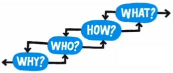
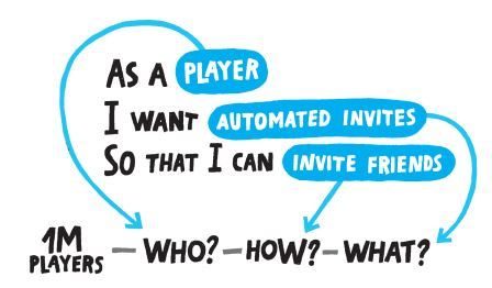
Defining the business goals is essential for any project and its the focus of Impact Maps. Why are we doing this? What is the goal that we are trying to achieve above all else?

Goal definition is about understanding the problem, not the solution. It should not be focused on specifically creating a product or application, rather explaining why its existence would be useful. It can be useful to try and tie the goal to the organisations value chain.

Examples:

  • Increase online conversions by 15% in the next quarter
  • Attract 20% more customers in the next financial year

Who

The first branch of an impact map looks at actors. For anyone who has spent some time with UML or traditional use cases you will know that actors can range from end-users and external suppliers to third-party applications or systems. Try and capture decision makers and those able to achieve the goal you defined or aid/block it from being achieved by others.

Consider the following questions at this stage:

  • Who can produce the desired effect? Who can obstruct it?
  • Who are the consumers or users of our product?
  • Who will be impacted by it?

These are the actors who can influence the outcome of your goal.

Examples:

  • Students with a tablet device or smart phone in the classroom
  • Corporate employees with access to the secure drive

How

The second branch level of an impact map sets the actors in the perspective of our business goal. Don’t list all the activities that an actor might want to take, just the ones that are focused on achieving your goal.

Consider the following questions at this stage:

  • How should our actors’ behavior change?
  • How can they help us to achieve the goal?
  • How can they obstruct or prevent us from succeeding?

These are the impacts that we’re trying to create. Note: They are not product features.

Examples:

  • Get faster access to accurate information
  • Have access to a wider network of colleagues to collaborate with

What

Once you have answered the goal, who and how questions you can start to consider and define your scope. This is the third branch level of your impact map and starts to identify the top level features of your product.

Consider the following questions at this stage:

  • What can we do, as an organisation or a delivery team, to support the required impacts?
  • What is the minimum that you can deliver to achieve your goal

These are the deliverables, software features and organisational activities. Do you not get too detailed at this stage and consider what the shortest route is through your map to the goal. It is very unlikely, and is potentially not a wise investment, to deliver all the features identified in your map.

Examples:

  • Product galleries
  • Online purchasing

When

This is a section that I have added but its a step that I find useful to help understand how a feature will help the organisation to achieve their goals. Agile uses the phrase “Definition of done” and in a similar way I like to think about “What success looks like”.

Consider the following questions at this stage:

  • How will you know when your goal has been achieved?
  • What action or level of engagement will signify a success for your feature?
  • How long will it take to get usable data from this feature?

The outputs from these questions will help formulate your measures or metrics. Where possible you should measure the smallest individual unit Avoid vanity measures, page views and impressions are worthless unless they prove an increase in conversion or engagement from your intended users.

Examples:

  • A completed signup form
  • A social media share

What are the outcomes?

In Adzic’s book he describes deliverables as being features, lines of code that helps organisations in achieving their goals, and of course he is right. However, I’ve often found it’s useful to understand at what point your Impact Map will be ‘finished’ and what the immediate deliverable from the exercise are.

Firstly if you are creating your Impact Map in a workshop then it will be produced within a timebox and will most likely be completed within the one session. Impact Maps are collaborative artifacts and unless you have all your stakeholder representatives available after the workshop, it’s not wise to carry on developing them in isolation.

Secondly, the largest deliverable from me as a business analyst are a prioritised list of features and measures, mapped against their actors (or personas) and goals. This allows you to quickly slice your Impact Map into a product backlog, understanding that what you have is probably high level epics that will require some breaking down into smaller stories.

user_stories

The diagram above shows how you can map the who, how & what into stories that can be worked up.

What do I need to impact map?

When I first drafted the outline of this post my intention had been to discuss different types of mind-mapping software here. And for the record, I use Xmind and have had some great results with it.

However, having written this post now, it’s clear to me that what you need in order to effectively Impact Map is a good mix of stakeholders who can represent both your organisations goals and your users needs. Without access to them you will not produce an effect map that adds real value and your roadmap and backlog will be flawed from the start.


Impact Mapping: Making a big impact with software products and projects by Gojko Adzic

If you’re interested in Impact Mapping you’ll need to get a copy of Adzic’s book. This colourful and illustrative book take you through the basics needed to facilitate and create an Impact Map for your team or customers.

[1] Adzic, Gojko. 2012. “Impact Mapping.” [online]. impactmapping.org

Lean UX: Agility through cross-functional collaboration

Update: Jeff’s presentation is now available online.

Today I was lucky enough to attend Jeff Gothelf’s O’Reilly webcast on Lean UX.

I was particularly keen to attend the webcast as I’ve been around Agile projects for some time, performing business analysis activities and supporting clients through rapid prototyping, but I wasn’t sure how to make UX activities Agile and I was hoping that this webcast would help me answer that.

Well the good news was, Jeff explained that Lean UX is inspired by Agile development theories:

Lean UX is the practice of bringing the true nature of our work to light faster, with less emphasis on deliverables and greater focus on the actual experience being designed.

And is based on the values from the Agile Manifesto:

  • Individuals and interactions vs. processes and tools
  • Working software vs. comprehensive documentation
  • Customer collaboration vs. contract negotiation
  • Responding to change vs. following a plan

Up until this point I hadn’t really seen any differences between Agile software development and what Jeff was describing as Lean UX. That’s when Jeff explained how Lean UX is really based on the Lean Startup Process. And how Lean UX had evolved the Lean Startup process to create this:

Figure 1: Lean UX Process. Source: Kevin Kauzlaric (http://kevinkauzlaric.com)
The Lean UX Process [1]
It started to make sense to me.

Note: I know it’s unfortunate that only this week I was tweeting that It’s Time to Retire ‘Crap Circles’, but it did the job!
#BadTiming

There has been a shift from can this product be developed (technically) to should this product be developed (because our users need need/want it).

Jeff went on to say that “In a fast-paced environments, traditional UX is a bottleneck. We have to change perspective on how to “do” UX, today’s markets require a new way. A faster way. Designers can no longer hide behind their monitors any more! This is a designer led initiative. Get designs out there. Fast. In public – where others can see them.

5 Things you need to do to be Lean

In Jeff’s presentation he suggested 5 tactics that you can do to help kickstart Lean UX into use in your projects:

  1. Solve the problem together
    • As opposed to implementing someone else’s problem.
    • Give them a problem to solve – not guidelines to implement a solution.
    • This team will be far more effective, motivated and productive if you do.
  2. Sketching – it’s all the rage!
    • Get the ideas out of peoples heads.
    • It’s NOT drawing, we don’t need to see the finished article. And you can do it collaboratively.
    • Doing it together allows software engineers and designers to problem solve.
    • Sketching brings experiences to life faster.
  3. Prototype it [Amen!]
    • Build an experience, not a document.
    • Once validated, demo it to the team. And get everyone started.
    • There are no additional deliverables needed!
  4. Pair up! But do it, cross-functionally.
    • Pairing saves time and builds a common language and a common understanding of the challenges.
    • You start to free up your designers and empower your developers.
    • Developers don’t have to wait for a design to start coding something and designers are freed up to do something difficult.
  5. Start a style guide
    • The cause of, and solution to, all UX problems.
    • A catalogue of the code snippets, the colour palette, the elements, the graphics.

Lean UX is not

If you’ve been around Agile projects in the past you’ve probably had to defend the things that it is not to the outside world. Lean UX is no different:

  1. Lazy
    • Its not a shortcut
  2. The only thing being removed is waste
    • Leave the toolbox intact, just use it one tool at a time and at the right time
  3. This is not a design by committee
    • That never leads to anything pretty

What did I learn?

A lot. As I’ve been writing this post I’m considering more of what Jeff described and how it can be worked into projects that I’m working on. There were a few nuggets that will stick with me though:

  • The Goal: Moving forward in parallel path with development and design.
  • ‘The Spec’ doesn’t control: Lead with the conversation, trail with the documentation (that you need).
  • The Pepsi challenge: Use data to settle subjective issues. A/B testing can settle them.
  • Go for bronze: You’re not aiming for gold medal work. It needs to be ‘just’ good enough.
  • Every design is a hypothesis: Don’t design things people don’t want. You can find out if people want theses things before hand.
  • Validate your hypothesis with the users: Keep it light and cheap. Put it in your diary once a week – get 3 or 4 people in and show them what you have ready to show them.

Lean UX: Applying Lean Principles to Improve User Experience by Jeff Gothelf. 

For more on Lean UX I strongly recommend this book. Mine is in the post!

For more on Jeff you can follow him here:
@jboogie
jeffgothelf.com

[1] Kauzkaric, Kevin. 2013. “‘Lean UX’ Can Propel You Ahead Of Your Competitors In Product Design” [online]. Published on 15th March 2013. http://kevinkauzlaric.com

Bringing Projects to Life Through Rapid Prototyping

Last week I presented a breakout session at Camp Digital 2013 on the topic of Rapid Prototyping.

Synopsis

Design and build projects are often difficult to kick-off, especially when you’re struggling to convey your ideas and understand the solutions being suggested. This can lead to delays, confusion and potential rework.

Sound familiar?

Rapid prototyping provides a quick and visual solution to identifying, documenting and validating project requirements in an interactive way.

In this session Jamie will take you through examples of rapid prototypes and show you how this approach can bring your projects to life and reduce development time, costs and help to maintain your relationship with your clients.

The presentation

Sigma Camp Digital 3D Shadows
Camp Digital – Manchester, UK

Camp Digital is a free, one-day event in Manchester exploring some of the most important and emerging themes in the digital industry.

Why not check out some more presentations and videos here?

Prototyping for BA Practitioners: The BA Coach

prototyping-for-business-analysis-pracitioners-572x168
When I started this blog my intention was to create something that would encourage me to learn new skills and document them in a way that meant I would remember them and could develop them in the future. Since I started writing I have come into contact with BAs from all over the world who are looking to do something similar, some to develop themselves and some to develop others.

One of the BAs that I have met and come to admire, for his personal pursuit of excellence and commitment to develop others, is Yamo a.k.a. TheBACoach.

I was thrilled when recently I was asked to be a guest author for TheBACoach. Over the next few weeks and months I will be working alongside Yamo to deliver some blog posts, podcasts and video training to help equip BAs in the art of prototyping and promote its use.Watch Full Movie Online Streaming Online and Download

I’m really keen to hear feedback on the articles/podcasts/videos. If you can think of ways you think they need to improve or have topics that you want covered in the series please let me know.