Card Sorting: Designing user informed categories

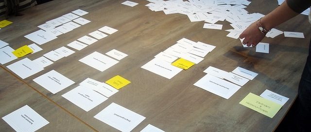
Card sorting is a technique for informing Information Architecture. It allows the architect to collect data on users categorisation preferences and gives them an opportunity to observe users discussing their reasons behind their choices.

Over at Boxes and Arrows Donna Spencer and Todd Warfel describe it as:

A great, reliable, inexpensive method for finding patterns in how users would expect to find content or functionality. [1]

An example

Imagine you’re standing in the supermarket and you’ve been given a list of items to purchase. The list is in no particular order and is completely uncategorised. You read down the list:

  • Shopping List:
  • Chicken
  • Oranges
  • Sweetcorn
  • Cotton wool balls

In your head you’re already starting to think “Is the Chicken in the meat aisle or the freezer section”, “Do I find the Cotton wool balls with the baby stuff or with the cosmetics”

This is what a user is doing when they come to your site for the first time. They’re trying to find something and they’re looking at the sections on your navigation and trying to work out where to go first. Which section titles best describe what they are looking for.

So how does Card Sorting help us with this? Well we do something similar to standing our users in a supermarket with a shopping list, except this time we ask the to group the items and name the groups in a way that makes sense to them.

Note: The following method is for an observed/moderated experiment. There are a number of great tools available on the web to help you setup remote/unmoderated experiments, however, I find that while these are great for producing a lot of data quickly, you lose the context provided by observing the users as they discuss cards and move them between categories.

Before you start

Picking your cards

I work on the basis that 75 cards will take your users about an hour to sort. So consider how many cards your users will be able to sort effectively in the time available. Also consider which pages to sort. You should strip out any category pages, as these will be replaced by your users newly named groupings. Typically you should be looking at 2nd/3rd level pages.

Preparing your cards

There are 3 things that I’d recommend each of your cards having:

1. A unique ID
This is purely for administrative purposes. It allows you to identify the cards during the analysis phase. Make sure it’s random and doesn’t relate to the section that the page currently lives in (if you’re experimenting with an existing site). Make it small, you don’t want to lead to the users into groupings based on the ID.
2. A page title
If you’re testing an existing site you may be able to pull these straight from the page titles in the metadata. However, if your page titles have been optimised for SEO (or spammed with keywords) you may want to clean these up so that you don’t mislead the user.
Watch out for any pages that may have duplicate names like “FAQs”. Some sites have one of these pages per product or per section, consider renaming it to “Product Name – FAQs”.
3. A short description
Again this may be able to be pulled from your pages metadata. The same consideration applies to SEO optimised descriptions. If the page title is a little ambiguous use the description to supply some context to the page.

Here is an example based on our supermarket scenario:

Free range corn-fed British chickenThis delicious and richly flavoured bird has a characteristically golden colour to the flesh, which comes from its maize based diet. The hens are reared in the same way as our other free range birds. 

#1

If you’re any good with a spreadsheet I’d recommend setting up a mail merge to print these. Depending on who you’re asking to take part, their location and the time between the sorts talking place and being able to start the analysis, you may need several sets of cards printing.

Recruiting users

Consider who you’re going to recruit to represent your users. Make sure that your sample is as representative as possible of gender, age, nationality, skill and role/user type.

Card sorts can be done with an individual user but you tend to not get a lot of discussion with users sharing their thought process or opinions. For this reason I’d suggest groups of 2 or 3 users so that there is plenty of discussion, you’ll be able to hear where there is consensus and where there is disagreement.

When recruiting users I would recommend a minimum of 5 groups, as this will give you 5 unique sets of data to analysis. While this is just my opinion it is loosely based on Jakob Nielsen’s Why You Only Need to Test with 5 Users.

If your site or application has a diverse range of users then perhaps consider 3 groups of each user type, or persona if you have created these.

Grab a copy of the analysis spreadsheet

Donna Spencer, whose definition of card sorting I used to open this post, has done a lot of work in the area of card sorting. This includes the production of some fantastic resources and materials to help you with your card sorting.

While the post is 5 years old the resources are regularly updated to ensure that formulas continue to work in the latest versions of excel etc. So for that reason I’d like to point you directly to Donna’s post on the Rosenfeld website.

Running the experiment

After the planning, the preparation of the cards, recruiting your users and scheduling the sorts to take place – running the actual sorts is relatively straight forward. However, there are some things that you can do to make the sorts go more smoothly:

Have a facilitator

If you’ve run any workshops in the past you’ll be more than use to facilitation. You should consider using the same skills to facilitate an experiment. The sorts of things that you should lookout for are as follows:

  • That everyone in the group is having an equal input
  • That the group is working as a team and not working against each other
  • That the group remains on topic

Do your best not to lead a group into making decisions, but you can advise or clarify to some extent if the group are running into real difficulty.

Run through an example

Just as I have given the example of a supermarket in this blog post you should make up 10/15 cards in advance that you can show the group. I like to use items from around the house. This quickly shows that items can be categorised by room (bedroom, lounge, kitchen etc) or by type (electrical, furniture, soft furnishings etc).

Be sure to explain that both are valid ways of categorisation and that the users should go with the approach that they are most comfortable with.

Observing and scribing

As well as having a facilitator in the experiment I would suggest having someone available to observe and scribe. If you have access to an observation lab the scribe could sit in the observation suite taking notes and recording the discussion and actions made by the group. It is not essential that your scribe be hidden away, I have been known to sit in on the experiment, recording, note taking and in some case photographing the groups activities.

If you are unable to get a scribe it as at least worth considering recording the session. Most iPods/iPhones will record through the headphone socket using the headphones straight to mp3 and you’ll be grateful of having something to go back to when you’re writing up your findings.

Spare cards and envelopes

Although this is a relatively low-cost experiment you’ll need to raid the stationary cupboard a few times…

It’s always worthwhile having some blank cards with you. Some users may want to split content or duplicate it into multiple categories, like the cotton wool balls that live in both ‘baby stuff’ and ‘cosmetics’. Allowing your users to duplicate the card by hand and putting it in both categories will act as an aid when it comes to the analysis.

You should also have a number of large envelopes with you. I like to take large A4 envelopes with me and allow the group to write on them and use them as placeholders for their categories. At the end of the experiment you can quickly collect up the cards and store them in the envelope that they are piled on. If you are doing more than 1 sort on the same day ensure you write which sort the cards belong to clearly on the envelopes.

The analysis

Once you’ve populated your spreadsheet with all your categories and cards from your sorts its time to start standardising your categories. When doing this you’re looking for 3 things, in my opinion:

1. The groupings of the cards into categories
Irrespective of the categories name, you want to look out for agreement by users that a set of cards should be categorised together.
2. The names given for the same category
Once you’ve identified that all your users put the cards bread, french stick and bagels into the same category then it’s time to review what they called those groups: 

  1. Breads
  2. Baked goods
  3. Bakery

You will have to come up with a naming convention and try to be consistent across all your categories. It may even be wise to consider search term traffic if you are looking to optimise your site for search, when picking a category name.

3. Spotting the dump category
When undertaking your analysis be mindful of the users that were in the groups. Consider their understanding of the content and if they are the target audience for all your content. I sometimes refer to something I have observed in the past as ‘the domain specialists vs. the dump category’.I’ll give you an example, where in a supermarket would you find Quorn (imitation meat mycoprotein) or a USB stick? If you’re a vegetarian or cook for vegetarians there is a good chance you know exactly where to go for the first item. Likewise, if you are into gadgets and are tech-savvy there is a good chance you’ll be able to find a USB stick in a supermarket and you’d know where to put it in a card sort. However, if you are neither a vegetarian or techie then you may simply give up. You may even create a category called ‘Misc’ and dump cards that you don’t know where they fit into it. 

More on analysis

There is quite a bit more to the analysis of card sorts, probably enough for another blog post on its own. As I suggested earlier, some of the best resources on ‘using the spreadsheet’ can be found on the Rosenfeld resource site.

Testing your new categories

So once you’re pretty happy that you have your categories, you have the items in them and you have determined a logical hierarchy, it’s time to test your IA. The following 2 methods can help to validate your IA:

Treejack

Treejack is an IA validation tool that allows you to test your IA without visual distractions.

You can create tasks for a user to undertake such as “You want to buy some fresh bread to make bacon sandwiches at the weekend, where would you locate the fresh bread?”.

The tool tracks the users path through the navigation and produces reports on their outcomes.

Task based testing

Once you have Treejack tested your IA it’s time to include it in any prototype that you would build during the design phase of the project. At Sigma we are big advocates or developing prototypes for testing, prior to sites or applications being developed.

Both these approaches will give you insight into how users interact with your categories and the content within them. Based on the results you may want to refine your IA further and re-test.

Conclusion

There are a lot of steps to this post and you may need to refer back to them at different times. The steps to a successful card sort are:

  1. Pick & prep your cards
  2. Run your experiment
  3. Analyse your results
  4. Test your findings

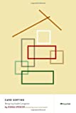
Card Sorting: Designing Usable Categories by Donna Spencer 

For more on Card Sorting I strongly recommend this book. In it, Donna describes how to plan and run a card sort, then analyse the results and apply the outcomes to your project.

It’s a great addition to the bookshelf and a great reference before, during and after a card sort.

[1] Spencer, Donna & Warfel, Todd. 2004. “Card sorting: a definitive guide.” [online]. Published on 7th April 2004. http://www.boxesandarrows.com

Annual UK BA Survey – Results from 2011

The UK IIBA is a chapter of the International Institute of Business Analysis representing the Business Analysis (BA) profession in the UK. The UK Chapter was formed in 2006 and runs regular events across the UK as well as hosting an annual European Conference.

The UK IIBA is a not for profit organisation and reinvests all funding received with the aim of
supporting the onward development of the BA Profession.

Back in December 2011 the UK IIBA launched it’s first ever survey designed to:

  • Paint a picture of the Business Analysis profession in the UK to understand its maturity, and in future years, track changes to the profession.
  • To provide insight to related industries who work closely with Business Analysts informing services and product offerings.
  • To create an industry benchmark across a range of areas for BAs and Practice Heads to show strengths and weaknesses against BA practice nationally or in their Market Sector

The survey went out to:

  • The IIBA UK mailing list which contains email details of around 3,000 BAs (both IIBA members and non-members)
  • The IIBA UK Website
  • The IIBA UK Twitter account which had 468 followers at the time of issue
  • Through promotion to known organisations with a stake in Business Analysis including
    AssistKD, BA Mentor, Barclays, British Gas, Certeco, EA Consulting Group, Hays, Hydrogen
    Group, IRM UK, The JM Group, Nicoll Curtin, Pragnalysis, Randstad, Reed Professional
    Services, Sanderson PLC and Skandia

Check out the results below:

Download Now to Read More

Prototyping: understanding the benefits to fidelity

If you’ve been around any software development projects then there is a good chance that you’ll have seen wireframes. Some sketched, maybe some mocked up in prototyping tools or crafted in photoshop. They are a popular tool to help conceptualise page layouts or even go as far as to demonstrate interactions in an application.

The level of detail or interaction that is present in a prototype is often described as fidelity. Fidelity is the degree of closeness to the “depth, breadth and finish of the intended product” (Hakim & Spitzer) [1].

To help explain the difference between low and high fidelity the following definitions are from Usability First:

low-fidelity prototype

a prototype that is sketchy and incomplete, that has some characteristics of the target product but is otherwise simple, usually in order to quickly produce the prototype and test broad concepts. [2]

These are the prototypes that you’d sketch in your notepad when describing the layout of a page or the interaction of an element with a colleague. You may capture them in a meeting with a client as a visual record of what has been discussed, so that you can work them up later into a design concept or higher fidelity prototype.

high-fidelity prototype

a prototype that is quite close to the final product, with lots of detail and functionality. From a user testing point of view, a high-fidelity prototype is close enough to a final product to be able to examine usability questions in detail and make strong conclusions about how behavior will relate to use of the final product. [2]

Unlike the quick sketch in your notebook, a high-fidelity prototype is at the other end of the scale. It’s likely to be rich with interaction, styled graphics and layouts that give the appearence of the finished product.

These are the two extreme end of the scale and in reality you will often be working somewhere between them. Some prototypes will have interactions but not so much visual treatment. Others will be worked up to a high level of design treatment but are just flat images, produced in photoshop with some image regions placed over the navigation to give the impression of a clickable ‘wired-up’ prototype. The reality is that often prototypes are just the vehicle to help us prove a concept or elicit requirements. They are not the end goal, just a means to help you reach it, so we take them as far as we need to go – as far as they remain useful and then we stop and move into code. Your choice about whether you go with a low vs high-fidelity approach is likely to be based on a time/cost/benefit decision, and each project is likely to be different.

There is nothing wrong with low or medium fidelity prototypes. I’ve worked on a number of great projects where this level of prototyping has generated some real rewards for all parties involved. However, more recently I have been working with very high-fidelity prototypes in two new ways. They are:

  1. JAD sessions
  2. Task based user testing

1. JAD Sessions
The purpose of a JAD session is to dramatically reduce the timeframe required to complete a deliverable where consensus is required by getting all of the major decision-makers, stakeholders, and knowledge providers into one place all at the same time.

The real-time production of a prototype during a JAD can help stimulate the discussion, capture decisions and demonstrate ideas and concepts to non-technical stakeholders.

Questions like, “What fields do we want to be capturing during the signup process” are easily answered when a marketing representative is present along with your database administrator. Consensus is reached and the prototype is updated to reflect this detail. The designer gives his input on the layout and one of the developers is able to highlight a constraints of the existing technology stack used. And then you move on to the next decision.

The prototype acts as the living record. The organic deliverable that in the space of 2 or 3 days has grown to encompass all the requirements, decisions and actions.

2. Task based user testing

Task-based User Testing is all about learning how users interact with your application or website in order to access information and complete tasks. Nielsen states that the biggest improvements in user experience come from gathering usability data as early as possible. He estimates that it’s 100 times cheaper to make changes before any code has been written than to wait until after the implementation is complete [3]. With this in mind it’s important to get user feedback and research findings as early in the process as possible, waiting until the site or application is live can be costly and impracticable.

While the prototype is not the finished product it’s important that it is worked up to a very high fidelity so that users are comfortable with its look and feel and aren’t distracted by inconsistent elements or broken interactions. The prototype requires a high level of polish and a set of well crafted scenarios to test and journeys through the prototype.

Working a prototype up to the is degree of fidelity requires time and skill but it’s a worthwhile investment to ensure that you can capture user feedback in the design phase, before any code is written.

Conclusion

Prototyping at any level will give you a great return. Your decisions on how close to make it to the finished product will depend on your budget, your deadline and the influence you are trying to achieve with it.

[1] Farnum, Chris. 2009. “What you should know about prototypes for user testing.” [online]. Published on 29th July 2009. http://www.boxesandarrows.com
[2] “Usability First, Glossary”. Accessed on 11th July 2012. http://www.usabilityfirst.com/
[3] Nielsen, Jakob. 2003. “Paper Prototyping: Getting User Data Before You Code.” Published on 14th April 2003. http://www.useit.com

Sigma Consulting: Technical Consultant

We Are Sigma
We Are Sigma
This month I joined a fantastic team based in Macclesfield called Sigma. The aim of my role is to support Sigma’s clients, designers and developers to better evaluate, specify and deliver successful solutions. Most of this is done through requirement elicitation, rapid prototyping and user testing.

Sigma are a user-focused digital communications company, who design and build smart solutions for web, mobile, and corporate applications.

They are the centre of excellence for user experience and digital services in the Sigma group, a Swedish based IT Services Company with over 1500 staff globally.

I have already had some great exposure to clients and projects. The team use some fantastic workshop techniques which I’m keen to post about soon.

Workshop Facilitation: Planning & Delivering

During a recent job interview I was asked to demonstrate my workshop skills. The company supplied some background about the project and the domain, along with a list of stakeholders that would be present in the workshop. I had 45 minutes to maximise my impact and capture some requirements, show some value add and write up some user stories. I was nervous.

Now this is a scenario I’ve been in 50 or 60 times in my professional career but never had I sat and thought “What is my workshop methodology?”, “What process am I going to follow to ensure requirements are captured systematically and to a high standard?”.

I turned to my trusty Business Analyst Handbook, flicked to the chapter on workshops and to my shock the advice was as follows:

  1. Open workshop
  2. Conduct workshop
  3. Close workshop

Well the above was useful, but I’d been successfully doing that bit for sometime now, I wanted a bit more.

I settled on some simple areas to focus on, that I felt could easily be reused as a basis for any workshop. They are as follows:

  • Why?
  • What?
  • How?

You can use this technique on a whiteboard, flip chart, with different colour post-it notes or index cards.

I prefer using A1 flip chart paper stuck to the wall, laid out as the diagram shows. The reason for this is quite simple, after the workshop you have a physical artefact to store, reference, review in any future workshops or conversations.

Workshop Diagram

Workshop capture screens. Each section represents a single A1 flip chart page.

Why?

Like all good business analysts my first thought was about the goal, the value, the vision.

I came up with the following questions:

  • Why are we doing this project?
  • What value will it add to our product and to our customer?
  • What is the vision for this project?

I identified that the Product Owner was probably the best-suited stakeholder to capture this information from and assigned a portion of the workshops time to this activity.

In my experience the sorts of answers that you get in this phase of a workshop are around business need. They often take the form of “We want to drive/increase traffic…”, “We want to increase conversions/revenue…” or “We want to save some money…”.

What?

The next area I focused on what what is being built. This might seem like quite an obvious point but it’s important to capture what your stakeholders are expecting to see built. If you fail to do this you may have stakeholders with falsely set expectation from the very start of the project.

Some of the questions I asked at this stage are:

  • What are we building?
  • What functionality is it going to have?
  • What is it going to look like?

Try and steer clear of any questions that ask about the technical implementation. Some projects will be bound by technology constraints from the outset, but as a BA try and remain as agnostic from the technology being used until you understand Why the project is needed and What is being built, only then can you pick the most appropriate technology.

In this part of the workshop it may be appropriate to draw some process flows or sketch some wireframes of the interface design. I identified that the UX consultant was probably the best stakeholder to capture this information from.

How?

By this stage you should now have a good idea about the project’s vision and the goals that it is attempting to achieve. You should also have a good understanding of what will be implemented during the project. This phase of the workshop gets down to the following:

  • How are we going to build it? Technology/Platform?
  • How are we going to resource the project? Internal/External staff
  • How will we know when the project is finished? Definition of done?

This is the time to discuss technical implementation of the project and any constraints that could be present during project delivery. All stakeholders will have input at this phase but Development/Technical leads and Product owner/managers will probably lead this phase.

Risks & Issues

This section is not a formal phase of the workshop, it’s something that runs in parallel to the previous 3 phases.

Those who have come from a project management background will be used to managing RAID logs. Now I’m not suggesting that as a BA you look to maintain a RAID log but there are often times during a workshop that you will capture feedback or information that needs to be recorded but doesn’t really fit into any of the above areas. These are sometimes non-functional requirements or constraints to the project.

The sorts of things that you will hear during your workshop that could be recorded as a risk or issue

  • All page loads must happen in under 1 second
  • The QA team need 4 weeks notice to write test scripts
  • A project manager has not yet been identified for this project

Conclusion

Workshops are a great tool for facilitating requirements collaboratively. They can be used to both understand a problem and to communicate a solution. By bringing together a range of stakeholders from across the business and delivery team it allows for all parties to be part of the solution. This can have a really positive effect on buy-in and stakeholder ownership of the project, which can only be a benefit.

Getting From User Stories to UX

Recently I wrote about User Stories and how card based software development can help identify ‘clear, brief descriptions of functionality as described from the perspective of a user’.

Today I want to look at how User Stories or ‘Stories’ can impact the user interface (UI) design and user experience (UX) of a software product.

So what is UX?
Don Norman (2007), Nielson Norman Group, describes it as

All aspects of a person’s experience with the system including industrial design graphics, the interface, the physical interaction and the manual.

I like this definition. It goes beyond the traditional Human Computer Interaction (HCI) thinking of physical device design. It goes beyond the point of how a user engages with a mouse and keyboard to get to the site or system and focuses on the software design and how the user interacts with it.

While there are many approaches available to User Experience Designers, Business Analysts and Software Designers, I’m going to be describing my approach to implementing UX in agile projects. I’m going to attempt to directly map these activities to the IIBA’s BABOK V2:

  • Elicitation
    • Persona Development
    • Story Writing
  • Analysis
    • Prototyping
    • Creative design and review
  • Communication
    • Managing Stories
  • Solution Assessment and Validation
    • Implementation and testing

Elicitation

Persona Development

Early last year I wrote about Users, Roles, and Personas and how they can help you as a BA to understand the users that you are designing systems and solutions for.

Stories are written from the human perspective, e.g. As a user I want to be able to do this or that. This is the shift I mentioned earlier from some of the more traditional “Systems Thinking” where we modelled what the system wanted to do. However, we can take this further by integrating Personas, by making the Persona the voice of the story.Watch Full Movie Online Streaming Online and Download

In other words, if we do a Persona workshop in the early stages of the project, each story that is created should correspond to one or more Personas. Let’s user a Facebook user, Rick, as our example. After modeling Rick and working up a relevant Persona, we can now leverage that in how we create and talk about our stories. For example, we can add a Persona prefix to our story statements:

Rick Says:
As a User
I Want To upload a photo
So That other users can view it

With this short prefix, we’ve both helped to make the story feel real and made a connection to a particular user that will perform this interaction. As we have conversations about this story we can talk about what Rick would want or not want, rather than what some anonymous and disembodied Facebook user.

Story Writing

In a recent post I covered the process of writing user stories using the Card, Conversation, Confirmation format. While I’m not going to cover the entire topic again here I’d like to stress the importance of getting real users to help write stories.

It’s also important to try and separate out design and requirements until you start to prototype and work on design concepts. Try to avoid allowing users to write the sorts of stories where they dictate UI implementation to you. These can often be expressed as “I want to ‘click on a button’ to” or “I want to ‘select from a list’ something”. In my experience a user is trying to help you, but often they are describing a legacy systems implementation of a particular feature and this can distract from why the action is being preformed and focus too much on the how the action will be performed.

Analysis

Prototyping

I could write an entire post on prototyping, and probably should. I am a real advocate of both low fidelity (lo-fi, often used to describe hand drawn or basic static wireframes) and high fidelity (hi-fi, often used to describe interactive prototypes). I am always amazed at how much feedback you can get from users by showing mock-ups and prototypes. As a caveat to this, my last note about not mixing requirements capture and design still stands. Try not to just sketch a quick solution in your notepad and show it to users in workshops. This can sometimes lead to a false setting of expectation and doesn’t allow you to properly test and capture feedback on the design.

Prototypes can perform two key functions:
1. They can be used to give early validation to a solution. Remember, user stories are small chunks of a bigger system. We can get validation feedback that the feature is correct, without having to have every page and feature implemented.

  1. They allow you to observe the user’s interaction with the proposed solution. I often find this activity more valuable then a users verbal feedback. This could take place in the form of formal lab testing scenario or as informal stakeholder reviews.

Creative design and review

In my experience visual treatment is usually applied to a prototype after it has been tested and signed off by the client. However, I know some teams don’t differentiate between the prototyping and creative stages in the process. To these teams the development of the prototype and visual treatment is the same stage, and their prototypes use the brand guidelines and colour pallet to allow for a much richer experience.

This is one of the exciting things about UX. As we move away from traditional HCI, UX is much more about the emotional experience than the physical one. UX is not just about demonstrating functionality ie. “If I click this then…” but far more about the journey that you are talking the user on to make engaging with your feature an enjoyable one.

Visual treatments and concepts can be tested at this stage also. User-centered design (UCD) focuses on analysing and foreseeing how users are likely to use a product, but also in testing the validity of their assumptions in real world tests with actual users. This can be performed in labs or using a range of remote testing solutions.

Like other aspects of agile, this is an iterative process and may take a few rounds of testing, feedback and implementation before the agreed design is agreed and put into production.

Communication

Managing Stories

There are a number of ways to manage stories, from story boards, spreadsheets and project management systems. While I don’t have a personal preference, I do use redmine for the electronic copy of my stories. Like other aspects of documentation on your project the important things to think about are:

  • Ease of collaboration
  • Visibility
  • Traceability

While it’s important to keep good documentation around your stories, these aren’t bound documents that BA’s working on traditional projects will be writing. It is important to think about how you can make them visible to the rest of the team and/or stakeholders. They should living documents, growing organically as more information comes to light.

The benefit of tracking these in a ticketing system like redmine is that you may even be able to offer traceability with the code repository. Other teams may check their stories and tests into SVN to live alongside the code.

Since my last post on the subject I have updated my base redmine user stories template to allow for some additional fields that you may want to capture when performing UX activities.

Solution Assessment and Validation

Implementation and testing

This is one area within the BABOK that I struggle with. While I obviously believe it’s important to validate a solution and test it, I’m not sure that I agree that this is a formal activity that happens at the end of the development life cycle. I think that the BABOK may be referring to a degree of formal signoff or UAT that takes place, however, on agile project my experience is that this happens on a much more regular occurrence.

Testing and validation of a solution can identify issues that can often be quickly and inexpensively corrected during the prototyping and design stages.

Conclusion

As Business Analysts we need to consider the use of such practices in our toolbox to help us communicate and demonstrate solutions to our clients or business teams. At the same time they can be used to collect rich feedback on a project before a single line of code is written.

BCS Manchester: Kanban Presentation

Finally I made it along to one of the BCS Manchester events. After re-joining the BCS last year this is the first of the local events that I’ve made it to, and it was excellent.

David Toon (@davidtoon83) presented his take on Kanban and took the group through the 4 principles of Kanban.

The group clearly had different levels of exposure in using Kanban and some used it for DevOps while others used it in a support role.

One of the things that struck me about Dave’s presentation was that he strongly advocated using it in conjunction with other methodologies such as SCRUM and even Waterfall…!

Anyway, the event was a success and the post-event beers went down well.

It looks like I may have been collared to d a write-up of the event so watch this space!
Clash of Clans Online Hack and Cheat

Kanban: Optimising for Predictability

On my last project we had a play with running a Kanban board. I’ve used Scrum on a number of occasions and am quite comfortable with writing User Stories and Tracking Estimates and Velocity but Kanban was something quite new.

Kanban is a JIT system that has its roots in the Toyota production system circa. 1940/50. It’s based on a simple queuing system that is intended to reduce the overall load of individual resources (designers, developers, testers, etc) by ensuring that packages are supplied to each resource just-in-time, preventing bottlenecks and/or too much slack in the process.

The Agile Extension to the BABOK says:

Kanban is a methodology for managing the flow of work to allow for evolutionary change.

There are 4 key aspects to implementing Kanban, they are:

  • Visualise the work
  • Limit work in progress (WIP)
  • Focus on flow
  • Continually Improve

Let’s look at those in a bit more details.

Visualise Workflow

Visualising your workflow involves getting the tasks required for a project or package of work up on a board, as this the interpretation of Kanban (カンバン?), literally meaning “signboard” or “billboard”. There are a number of electronic systems for this, but I find that getting a board up in a space that your team can get around adds great value and a great opportunity for collaboration amongst the team.

The board is divided into swim-lanes and cards or tasks move from left to right until completed. This gives the team, not just the project manager, visibility on where bottlenecks are building on the board.

Kanban Board
Figure 1: Kanban Board. Source: BABOK Agile Extension

Different teams will pick different names for their swim lanes but I think the above is a good starting point for lane names.

Limit work in progress (WIP)

Limiting work in progress is the process of determining the maximum number of cards that can be worked on in any swim-lane. In the example shown in Figure 1, we can assume there is a development limit of 2. That is to say that the total number of cards that can be across both Waiting for Dev and Dev can not exceed 2. If we look at testing and assume that the testers have a lane limit of 3 then the following is true:

  • Dev can not put anything else in to test until “Generate Receipt” is Done.
  • Dev can not ‘pull’ anything else from Analysis until they move at least one card into Testing.

As soon as a task is completed in testing a vacuum  is created and test can pull from development, development can pull from analysis and analysis can pull from the backlog.

Once you start to reduce WIP you start a continuous improvement cycle within the process. This allows you to make better decisions on your resourcing profile on the project.

Focus on flow

Flow can be measured using CFDs or Cumulative Flow Diagrams. These diagrams can be really useful when attempting to analyse flow through the board and identifying areas for improvement.

The following diagram shows a simple but accurate example of how a CFD can be used to show the amount of tasks in each lane over the duration of the project. we can see that at the beginning of the project the backlog was large (to-do), the in progress work was very small and there was no work completed. On days 6, 11, 20 and 24 deployments were made pushing work from in progress to done.

CFD
Figure 2: CFD. Source: Positive Incline (http://positiveincline.com)

Continually Improve

The CFD can be used as a tool to show the effects of any changes that you make to the team or your WIP policies throughout the duration of the project. Track if individual changes have a positive or negative effect on the flow through the board. At this stage you should be looking to optimise for more predictable flow.

The following may help for produce improvements:

  • Investing in CI tools to help your team deploy more regularly
  • Implementing WIP limits and Pull Conditions
  • Training developers to write tests for their code. This may improve quality and reduce the amount of time code sits in test
  • Increase resources in one of your skill areas

Every team understand its own pressures and resource/investment constraints. However, a CFD will help you optimise your flow within those constraints to produce a predictable flow of delivery.

Conclusion

Kanban is a very powerful tool for helping a team understand where bottlenecks are in production and gives tools to help track the effects changes to the pipeline may effect that bottleneck. Some of the best advice I had from a member of my team who had a lot of experience with Kanban was:

  1. Start with what you do now
  2. Agree to make a change
  3. Respect your core rules (wip limits)
  4. Get better!

User Stories: Card, Conversation, Confirmation

I’ve recently rediscovered my love for user stories. While some projects call for a formal, more traditional approach with strict documentation, others call for collaboration and quick results. It is this latter approach that user stories were designed for.

User stories are simple, clear, brief descriptions of functionality as described from the perspective of a user. Note: A User Story should not be mistaken for a Use Case. User stories in agile development can be useful to users and customers of the software. These user stories can then become the product backlog of an agile project.

When writing user stories I like to start with a pile of blank index cards and plenty of space to lay them out or a large board to stick them up. Ideally you will have with you a representative of your client (if this is not an internal project), like a product owner, project manager or BA. This allows for collaboration and discussion between the IT delivery team and the project owners or sponsors. I use the following as a guide for writing stories:

Front of Card
Front of Card
Back of Card
Back of Card

Card

The aim of the card is to capture the following three areas:

As a [user], I want to [action/function], so that [value]

The simplicity of this template is important. I recently wrote about the Agile Manifesto, a guide to better interactions and collaborations. User stories production needs to be accessible to everyone and so this informal format helps to engage the entire project team to get involved.

Writing these out on an index card allows them to be produced quickly, discussed, adapted and moved around based on priority.

Here are some example stories that I have created for Facebook:

As a User
I Want To search by name
So That I can find my friends and associates
As a User
I Want To upload a photo
So That other users can view it

The first part of the card defines the Who, What and Why. But it’s not all the detail. This is where the conversation comes in.

Conversation

The conversation part of the story is an opportunity to elaborate on the details captured at the previous stage. In some planning meetings this will happen as the card is being written. In other cases this conversation will grow dynamically as both developers and clients understanding of the feature to be implemented improves. It allows for continuous dialogue around a feature, with the detail being recoded here.

For example, I previously used a photo upload user story, and have decide that there are actually multiple things that can happen, so we split them, and expand on them:

As a User, I want to upload a photo from my local machine so that any users can view it.


  • There will be an upload button at the top of my profile page
  • There will be a file size limit of 25MB
  • The supported formats are: jpeg, png, gif and bmp
As a User, I want to tag my friends and write a caption before publishing a photo to save myself time.


  • The fields that can be edited are: caption, location, tags
  • On save the image will be published

In many case a card will go through an analysis or elaboration step prior to making it into development. It is often at this stage that the conversation section will be completed. I find it important to be as verbose as possible here, providing the developer with all the detail required to complete the feature. It is at this point I ensure that the card is duplicated into an electronic format. I have seen some good spreadsheets for managing stories but I favour ticket tracking software as it allows documents to be attached. These could be process flows, business logic, designs or wireframes. I keep the paper copy of the card and reference the ticket ID on it so that there is a link between the physical asset and the electronic copy. I use the following Redmine User Story Template to help me format my tickets.

Confirmation

The confirmation part of the card is a space for a test case to go. These are steps or scenarios that help a developer test and a customer or user perform UAT. If your development team are undertaking Test Driven Development (TDD) these steps will form the basis of their test writing.

  1. Click the “Upload” button.
  2. Specify a picture file to upload.
    1. Check that .jpg, .png, .gif and .bmp extensions are supported.
    2. Check that other filetypes aren’t able to be uploaded.
    3. Check that files larger than 25MB results in an error.
  3. Click “Upload Photo”.

I try and write the confirmation parts of my story as I am having the conversation with the client or customer. Acceptance testing can allow you to limit scope of the feature and make you more confident in the estimate supplied. In the above card a requirement was captured for 4 different file formats. If your customer wants to change this in the future, agile allows for this, but until they do its part of the requirement that only 4 formats will be allowed. This allows us to define our Definition of Done, when all the conditions are met development can stop.

Conclusion

Writing user stories can be quick and productive. It removes the overhead of detailed static documentation and makes way for creativity and collaboration. However, there is a lot more to user stories then just writing cards. Previously I have written about Measuring and Monitoring Velocity and my next post will be on Story Maps.

BABOK Agile Extension for Business Analysts

Today the IIBA launched its new Agile Extension to the BABOK® Guide. Get it at iiba.info/AgileExtension.

The BABOK® is the IIBA’s Business Analyst Book of Knowledge that is the first formal approach of defining and documenting what the role of a business analyst does.

The purpose of this extension is to:Watch Full Movie Online Streaming Online and Download

  • Highlight the importance of business analysis practices in an agile context
  • Show how business analysis is performed in agile lifecycles
  • Offer key principles that should guide business analysis practice in agile environments
  • Develop existing business analysis tasks, and existing techniques and show how they are useful in an agile context
  • Give information on new techniques and additional information on existing techniques

As someone that has been working in this space for some time, attempting to adapt my existing skillset and knowledge to an agile environment,

I am really excited. I’m about half way through and I suspect that I’ll read it and re-read it.

It’s exciting to see agile adoption on the increase and this extension book will help BA’s feel equipped to work with developers and clients who are actively using SCRUM, XP or KANBAN.

My hope is to prepare some posts and feedback from what I’ve read in the extension, I’m also keen to see how my own approaches compare to those that have been outlined in the guide.